Presentation and Graphics
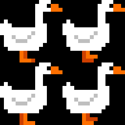
While previous devlogs have shown the graphics and artstyle used by the game, this log focuses exclusively on the presentation of Goose Got Gun. Every sprite used in the game was designed by myself, using the software paint.net.

In order to evoke the game's intended retro aesthetic, the player and enemies use small, brightly-coloured sprites. In order to ensure that the sprites were correctly animated under specific conditions, the movement script for the player and the logic script for the mandarin ducks send information to their respective sprite animators, telling them to only animate when movement is occurring - as the other enemies do not ever stop moving, no commands are sent to their animators telling them to stop animating.

The sprites for the player were designed first, with the various enemy sprites being modified from those.


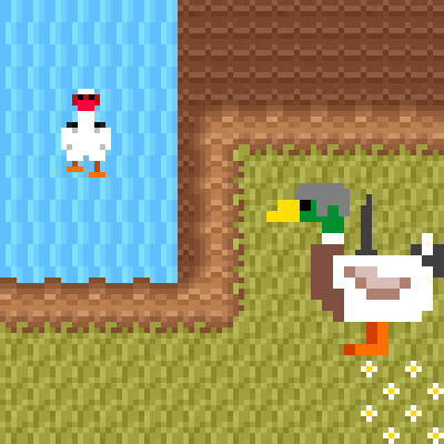
In addition to enemy and player sprites, the tilesets for the game's levels were also custom-designed. As opposed to character sprites, which primarily use flat colours with no noise, the backgrounds have a moderate amount of detail in them (as much as can be done in a 16x16 sprite, anyway). The main reason this was done is to help the player and enemies 'pop out' from the background slightly, their simplicity helping distinguish them from a slightly noisy background. The waterfall level (bottom image above) also uses more desaturated colours, to further help in achieving this goal.
Goose Got Gun
| Status | In development |
| Author | AiWantToD-Ai |
| Genre | Shooter |
| Tags | 2D, Singleplayer |
More posts
- User GuideOct 16, 2022
- Assets and Comparison to ConceptOct 16, 2022
- Polish and UIOct 16, 2022
- Enemies and InteractionOct 01, 2022
- Basic Level BlockingSep 25, 2022
- Player MovementSep 12, 2022
- Game Concept DevlogAug 26, 2022